Build productswith clarity.
A Figma design system built on tokens, not stickers. Every component reads the same 1,028 variables, so Light, Dark and a full rebrand are one mode switch away.
- Components
- 66
- 81 component sets
- Variants
- 3,534
- Every size, state & theme
- Variables
- 1,028
- 9 collections · Light & Dark
- Components in the file
- 11,803total
- Incl. icons, patterns & blocks


Used by 500+ professionals
The reel · 48 s
From one token to every screen.
Color ramps and AAA contrast checks, the Light ↔ Dark token swap, components, a wall of blocks and the glass material — every frame rendered from the real Figma file.
Architecture
One source of truth. Five layers, zero guesswork.
Primitives feed semantic tokens, tokens feed components, components compose into patterns and full-page blocks — all wired to Figma variables.
blue/50 → blue/950 · 10 hues · 2 modes
Foundations
1,028 variables, two modes
Color, type, spacing, radius, shadows, gradients and grid — every value a token, every token in Light & Dark.
Components
66 components, 3,534 variants
From Button to Video Player: every size, state and theme, built with Auto Layout and smart properties.
Patterns
89 patterns in 14 families
AI chat, tables, pickers, settings, commerce and onboarding, with 365 AAA contrast checks.
Blocks
11 block collections
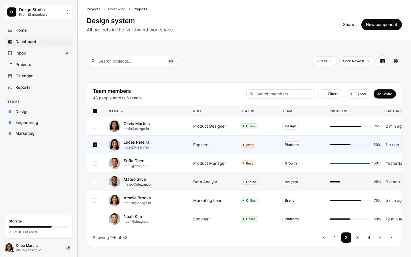
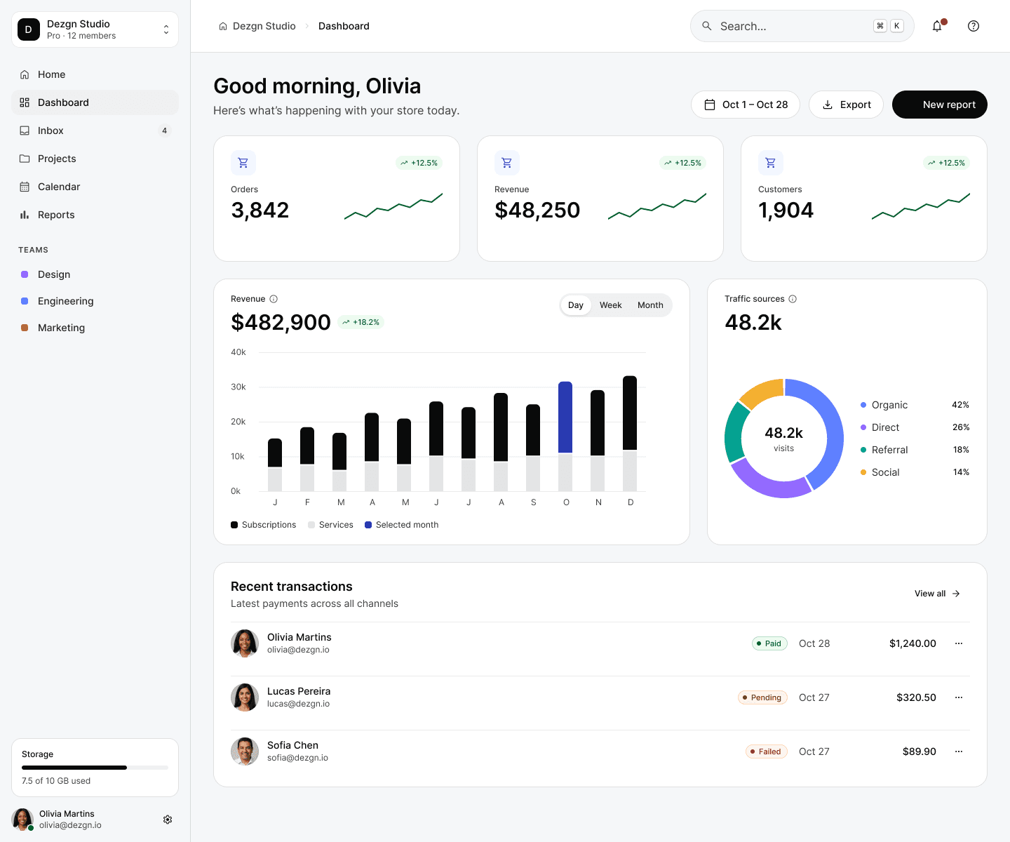
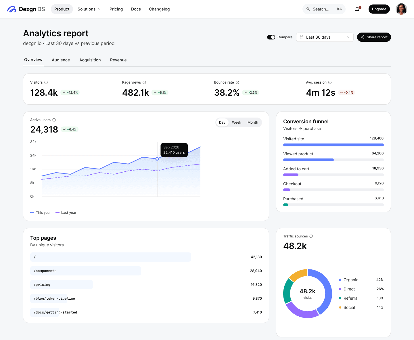
Heroes, pricing, dashboards, auth and workspace screens — drop one in and keep building.
Monthly revenue
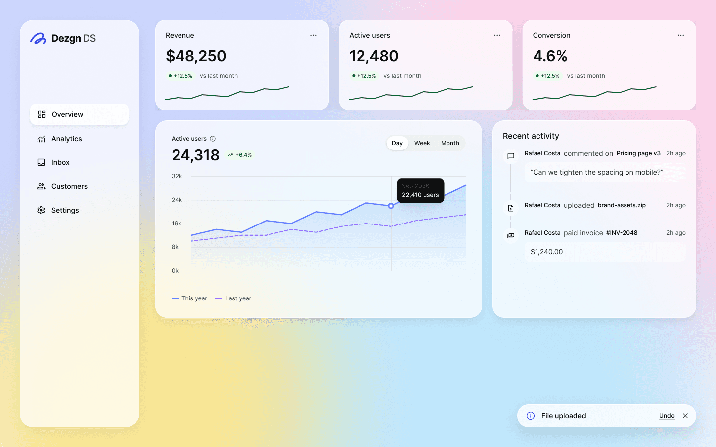
$48,250
Monthly revenue
$48,250
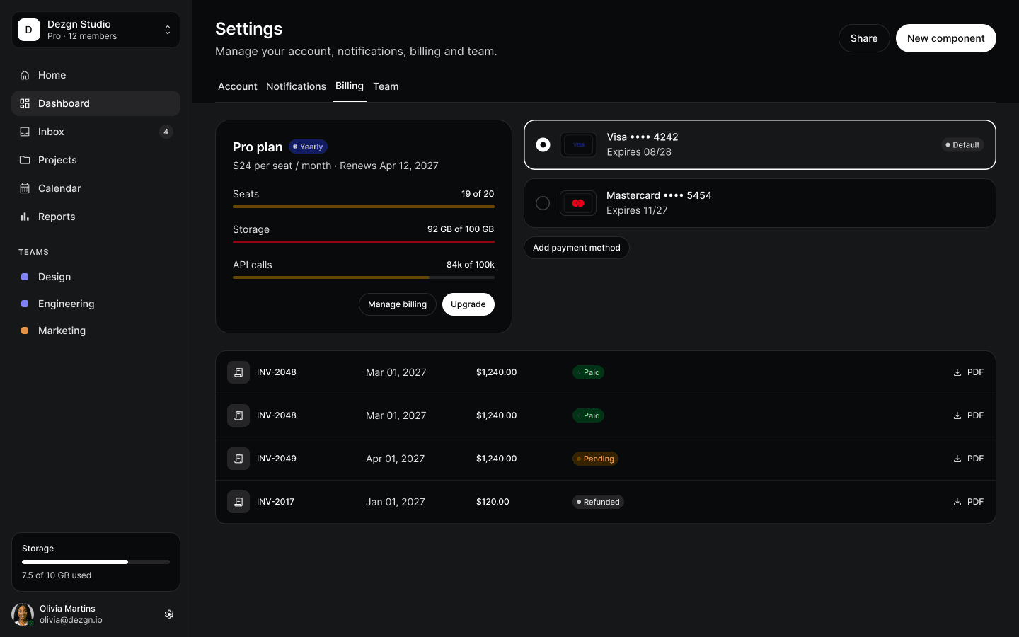
Dark mode
Dark is already drawn
Color is a token and tokens have two modes, so every component ships with its Dark twin.
Miscellaneous
17 extra sets
Icons, flags, emoji, file types, payment cards, crypto, brand logos, keyboard keys and more.
Live playground
Precision-built. Try it yourself.
Every tile below is a Dezgn DS component, rebuilt live from the same tokens. Flip the theme — one variable mode switches everything.
vs. $42,890 last month
Check your email
Enter the 4-digit code we sent to olivia@dezgn.io
Pro plan
$24 / seat / mo
Active users
19,364
Push notifications
Mentions and replies
Weekly digest
Every Monday, 9am
AI suggestions
Smart replies in chat
File uploaded
brand-guidelines.pdf is ready to share.
Blocks
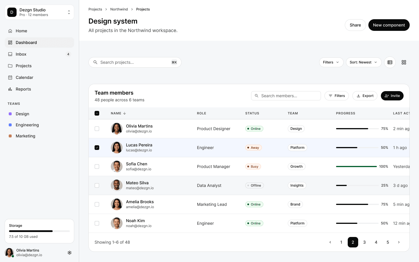
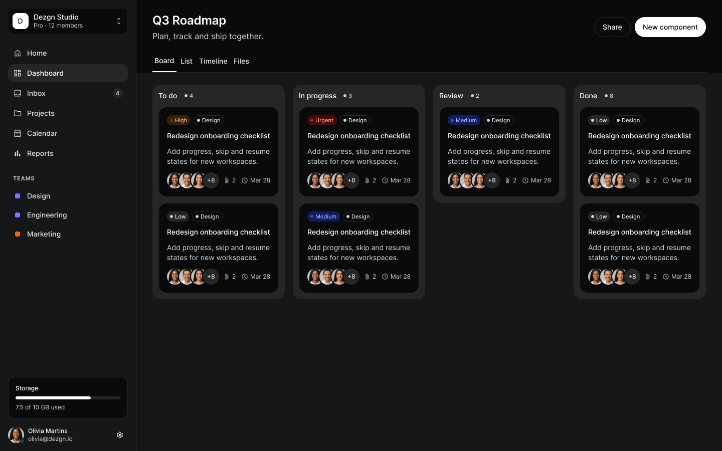
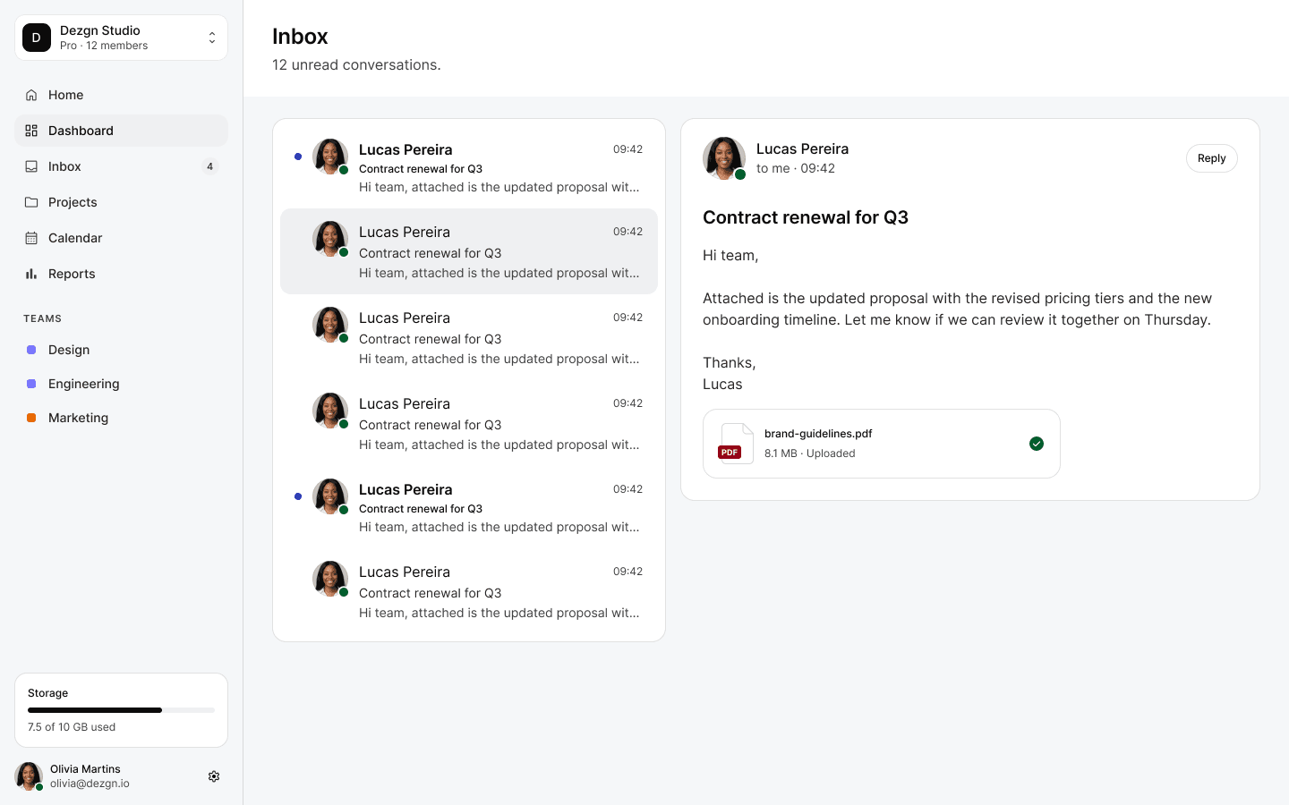
Start at screen level, not at button level.
Complete app screens built from the same components and wired to the same tokens. Open one and keep building.
Components
One architecture under every component.
66 components, 14 pattern families and 11 block collections — every one reads the same variables, in Light and Dark.
- Accordion
- Alert
- Aspect Ratio
- Audio Player
- Badge
- Banner
- Breadcrumb
- Button
- Button Tile
- Card
- Carousel
- Checkbox
- Color Selector
- Combobox
- Date & Time Input
- Dialog
- Digit Entry
- Dimming Overlay
- Divider
- Drawer
- Dropdown Menu
- Editor Toolbar
- File Drop
- Gallery
- Icon Button
- Info Label
- Inline Message
- Kbd
- Lightbox
- Link
- List Item
- List Menu
- List Tree
- Mega Menu
- Modal
- Multi-select
- Nav Menu
- Navbar
- Page Control
- Pagination
- Phone Input
- Popover
- Progress
- Radio
- Rating
- Resizable Panels
- Scrollbar
- Segmented Control
- Select
- Shortcut
- Skeleton Shape
- Slider
- Spinner
- Stepper & Index Bar
- Steps
- Switch
- Table of Contents
- Tabs
- Tag
- Text Area
- Text Field
- Toast
- Toolbar
- Tooltip
- Video Player
- Wells
- AI & Chat
- Menus & Search
- Pickers
- Tables & Charts
- Forms & Feedback
- App Navigation
- Mobile & Devices
- Cards & Stats
- Lists & Feeds
- Settings & Account
- Commerce & Pricing
- Empty States & Onboarding
- Page Headers & Toolbars
- Marketing
- Heroes & Navigation
- Home & Features
- Features & Social Proof
- Pricing, CTA & Footers
- Content & Company
- Content & Contact
- App Screens
- Workspace Screens
- Auth & System
- Auth & System Screens
- Glass Showcase
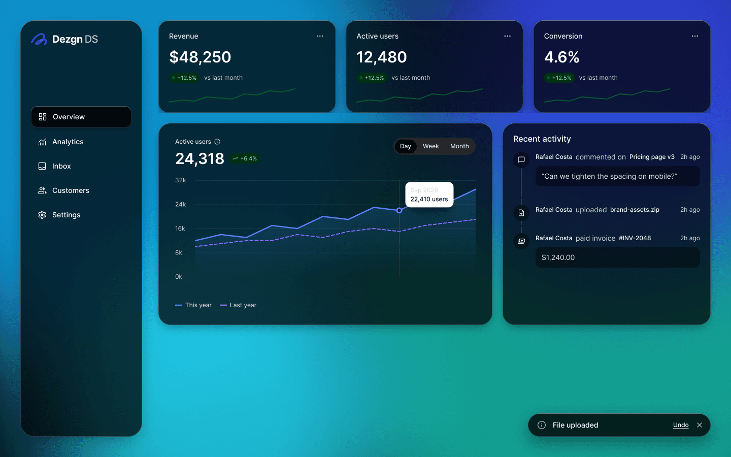
Glass material · Dark mode mastery
Interfaces that feel like light.
A frosted, tokenized glass layer for every surface. Drag the handle — or use the arrow keys — to compare Light and Dark.
4
glass materials
4
backdrops
7:1
text contrast
10
glass blocks
Pricing
Pay once. Own it forever.
A lifetime license with every future update. No subscription, no seat math. Secure checkout by Stripe.
Prices in USD. Taxes calculated at checkout. Payments processed securely by Stripe.
FAQ
Questions, answered.
Everything you need to know before you open the file.
A complete Figma design system: 1,028 variables, 66 components with 3,534 variants (11,803 components across the whole file), 89 patterns, 11 block collections and a glass material — all in Light & Dark.